Before No direction
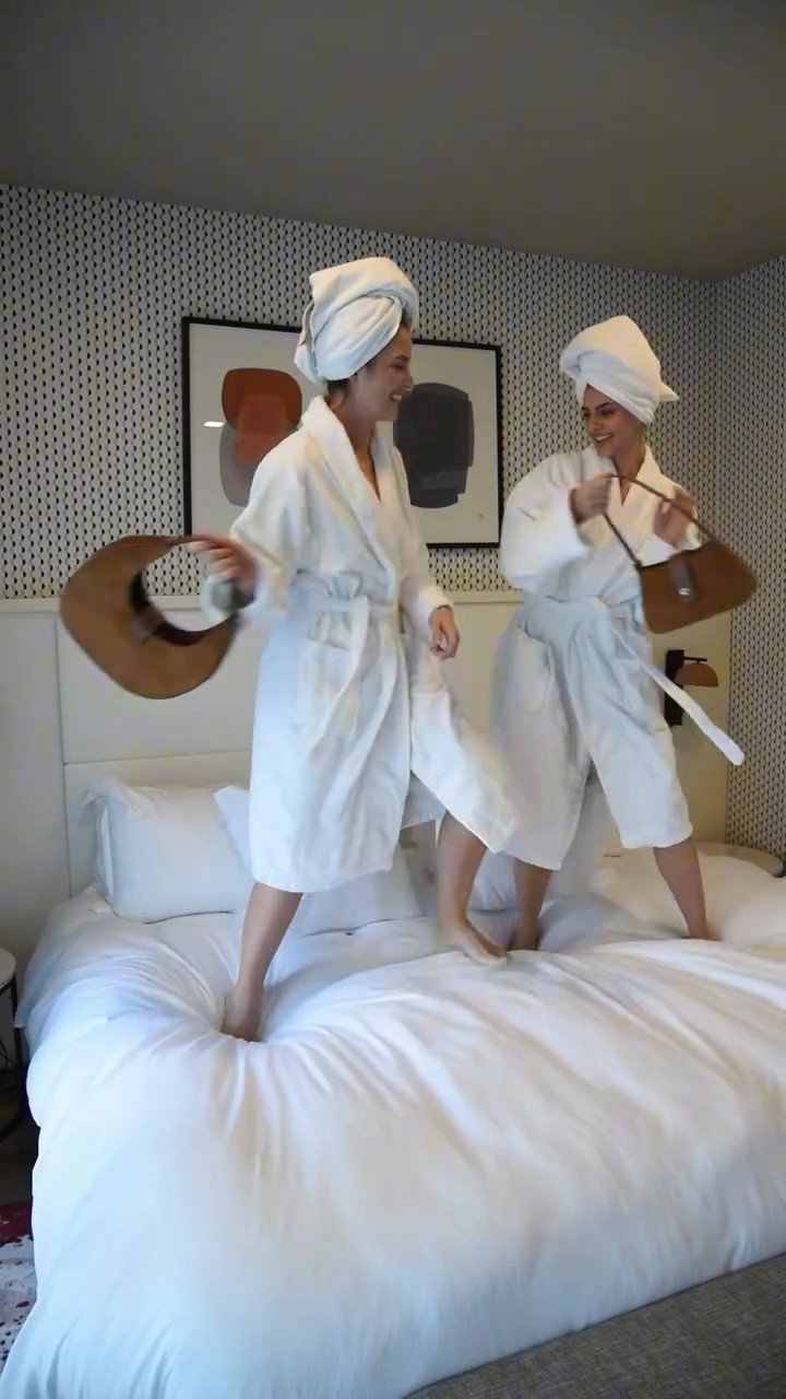
Fragmented brand identity, standardized communication, flat aesthetics, and low organic engagement.
Project 01
Strategic Art Direction & Visual Identity
Art direction is not merely decoration, but strategic visual storytelling. I lead the development of immersive concepts, brand identities and cross-media campaigns for the fashion, music and entertainment sectors.
Core Competencies
Conceptual moodboards, definition of proprietary aesthetic codes, set design for live shows and editorial shoots.
The Approach
I combine archival aesthetic sensibilities with digital innovation, including AI-driven workflows and highly viral short-form content, to accelerate creative processes and maximise the brand's cultural resonance.
The Transformation Blueprint
Every brand possesses an unexpressed soul. Here is how a Creative Curation intervention transforms market metrics.
Before No direction
Fragmented brand identity, standardized communication, flat aesthetics, and low organic engagement.
After With art direction

A coherent and recognizable aesthetic, visual codes aligned with international trends, and premium positioning.
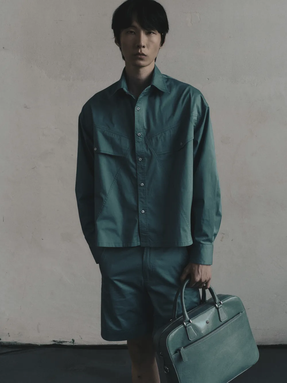
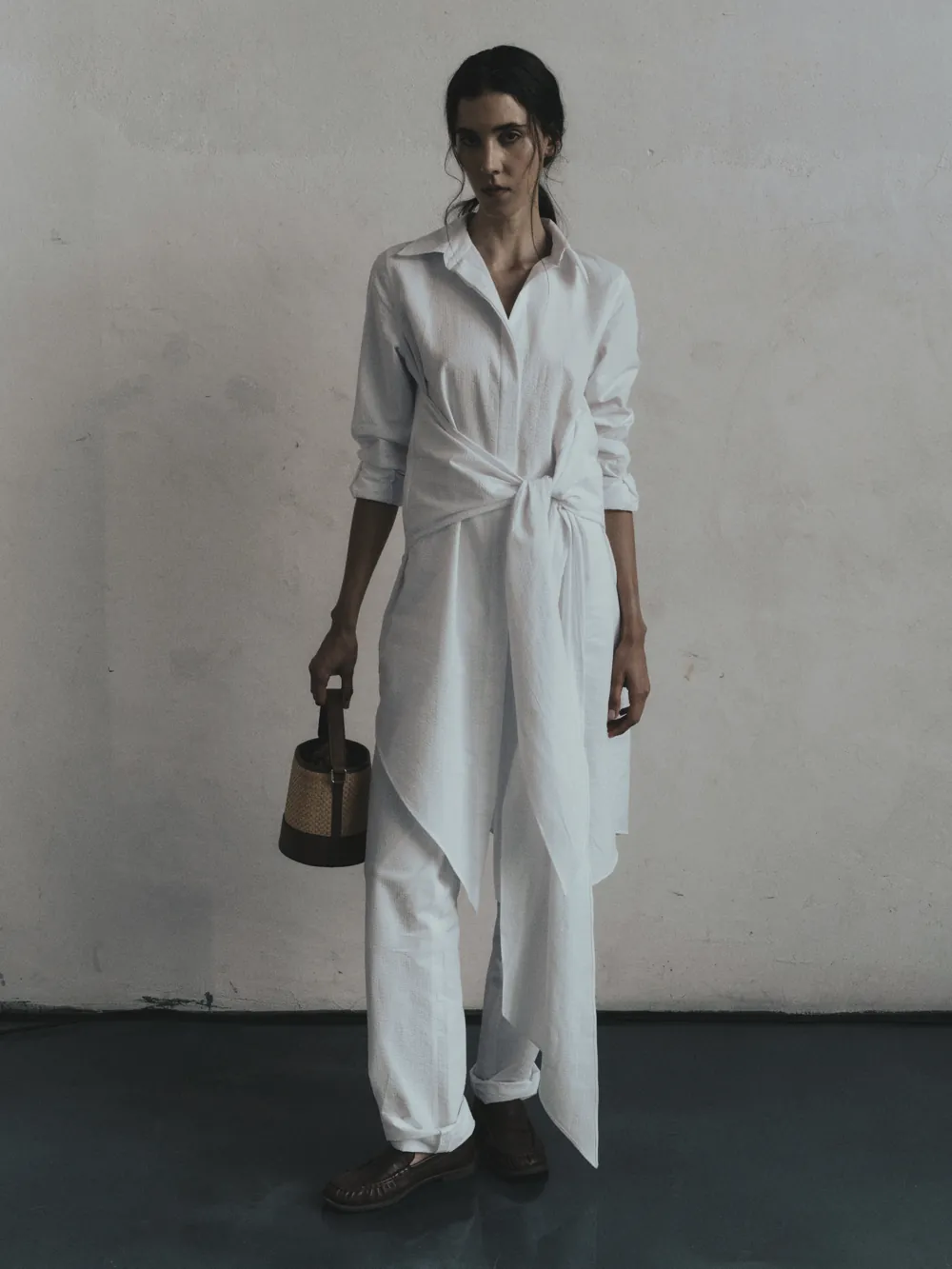
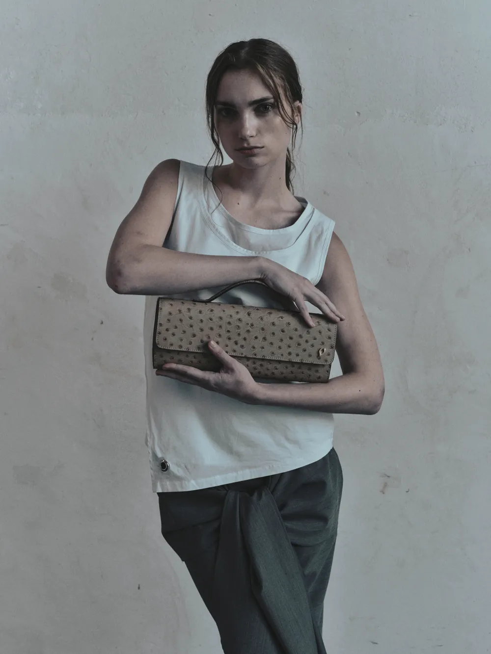
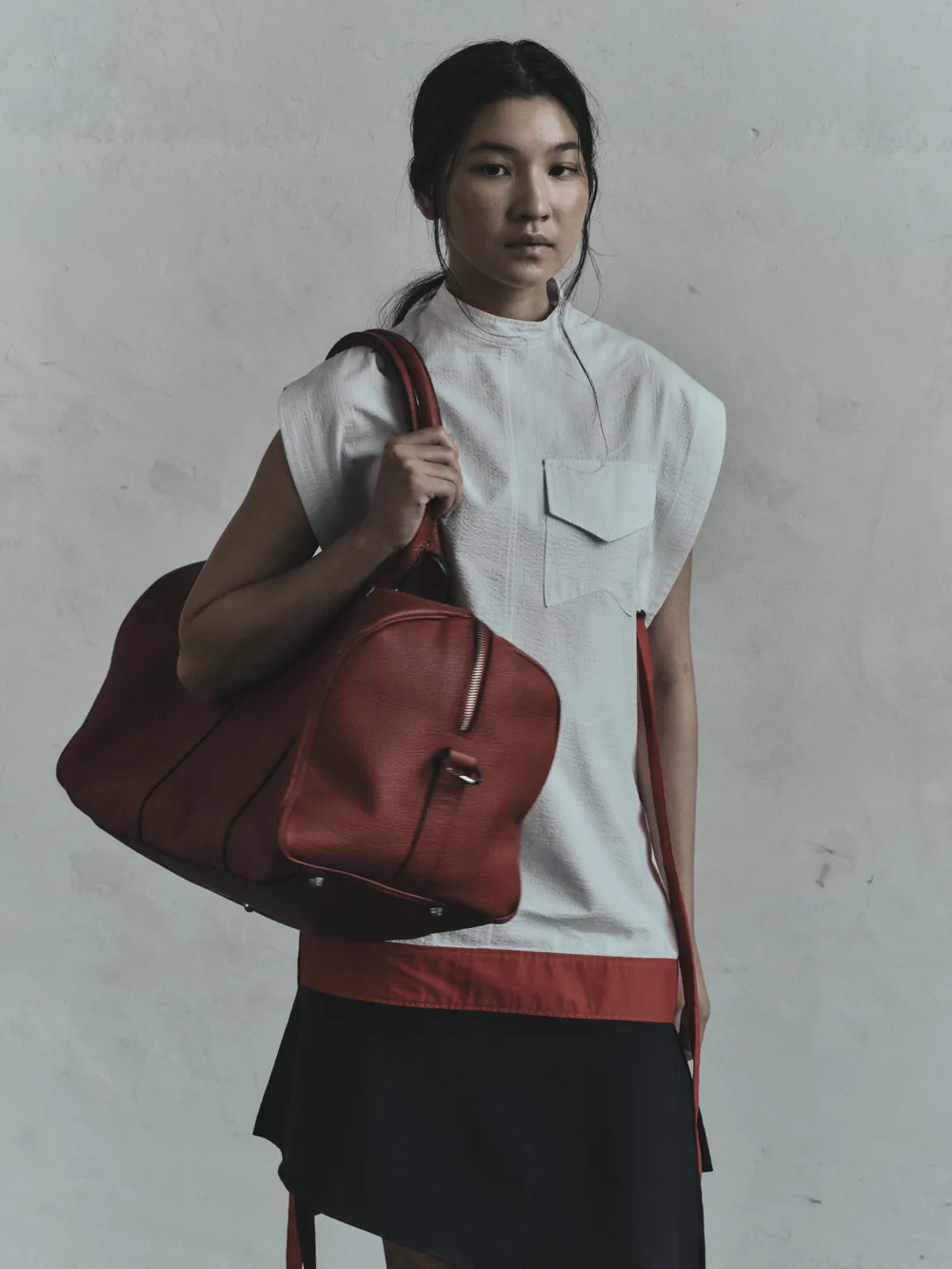
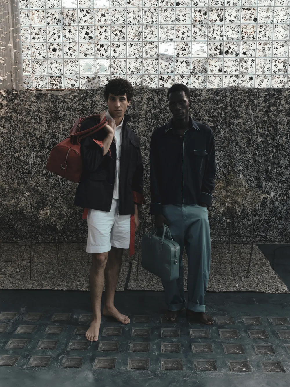
LA CONTRORA
Vega Bags SS27
Fondazione Sozzani in collaboration with moarno, Milano Fashion Week
Scroll sideways
The club was being filmed the same way the restaurant was: whatever happened in front of the camera, handheld, in landscape, posted as it came out. The relaunch moved the subject from the plate to the place — and the format from 16:9 to the one the audience actually watches in.
Before Landscape · handheld
A single handheld take of a seafood platter, filmed horizontally at the table. It shows the food and nothing around it: no coastline, no boat, no reason to travel for any of it. Shot in 16:9, it then has to be cropped or letterboxed for every feed it ends up in, so the framing is wrong twice over.
After Vertical · graded
Scroll sideways
Four vertical clips built on one palette (white hull, navy water, hard sunlight) and on one idea per shot: the object, the movement, the place, the lifestyle. Filmed 9:16 so nothing gets cropped on the platform they live on, and cut so any one of them can open the sequence. The club stopped posting what was on the table and started posting where the table is.
The mark had to be redrawn before anything else could be designed. Every decision further down the line (the website, the feed, the menus, the signage) inherits its proportions, its weight and its typeface, so the logo is where the direction either holds or falls apart.
Before Generic monogram

A V and an L borrowed from two unrelated typefaces, a heavy geometric sans and a thin serif, dropped inside an open circle. The circle frames the letters without holding them, the L is swallowed by the V as soon as the logo gets small, and nothing in the drawing points to the sea, to hospitality or to the name itself. It worked as a placeholder, never as a signature.
After Vega Yacht Club

Two mirrored V's interlock into a single continuous knot, drawn with one stroke weight and the tapered joints of a high-contrast serif. Above it sits the eight-pointed star: Vega is the navigation star the club is named after, so the reference became the mark rather than an ornament hung beside it. The shape stays legible at the size of a signet ring, a hull decal or a favicon.


Why it holds
The mark is built on a grid, so it survives being stacked, set on one line or cut down to the star alone. That is what lets the same identity carry a menu, a hull and an Instagram avatar without being redrawn each time, and it is the piece the website and the feed are built on top of.


Outcome
Exponential growth in engagement, a high-end luxury perception and the production of viral content.
From Atelier to Global Stage
Former Lead Designer for rapidly growing brands and couture houses. As Creative Lead at Archives, overseeing everything from fabric and silhouette research to production, I steered the brand to an extraordinary achievement.
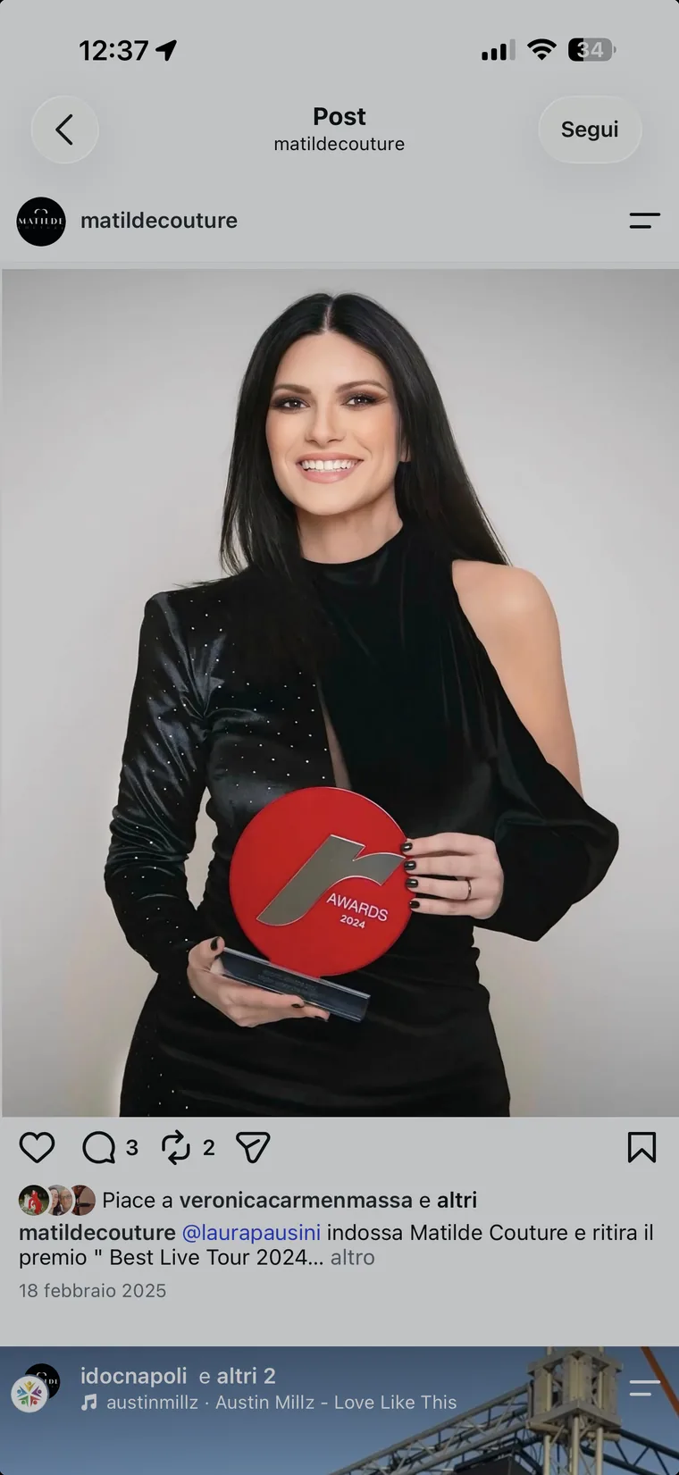
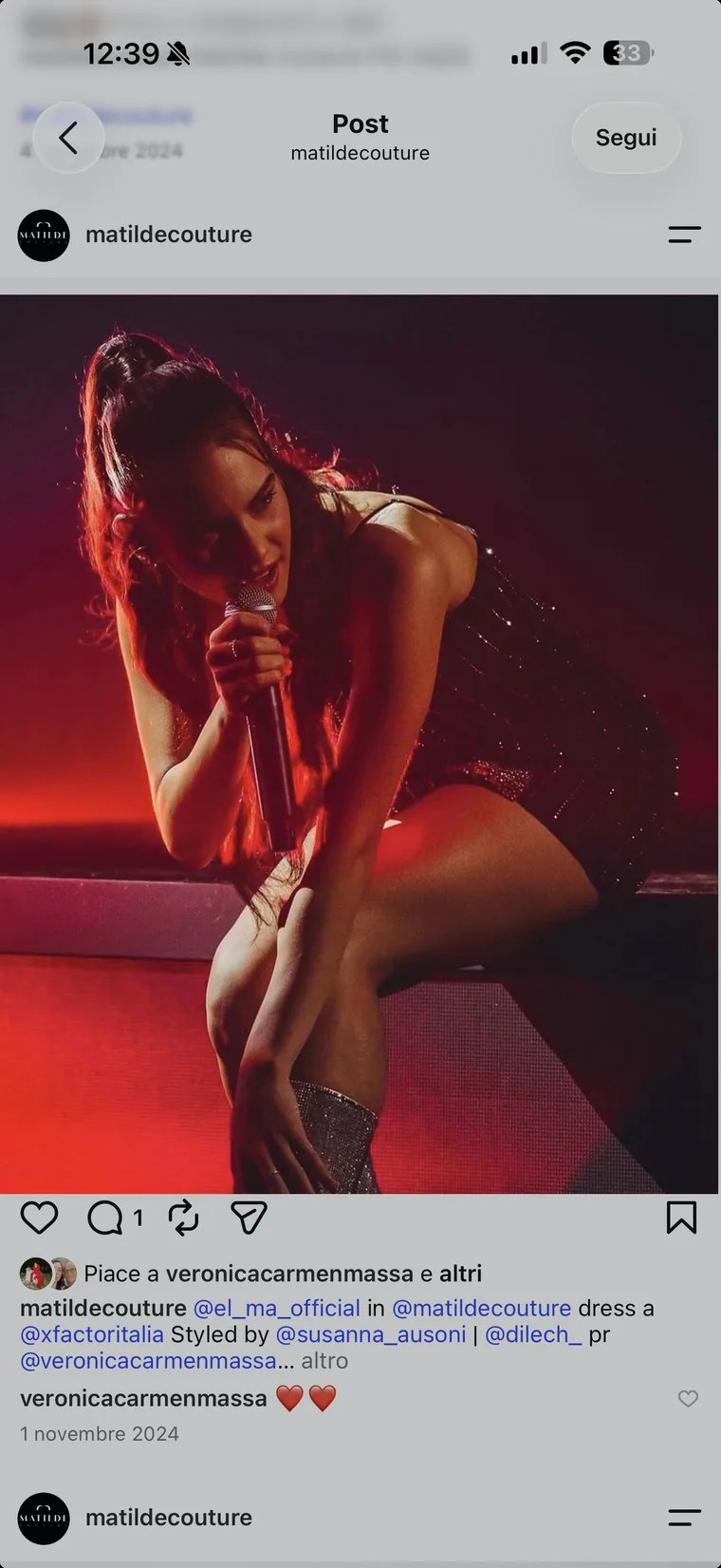
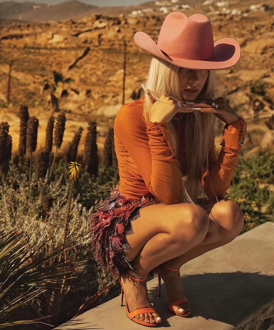
Tailored garments chosen by Italian and international celebrities for red carpets and global television shows.
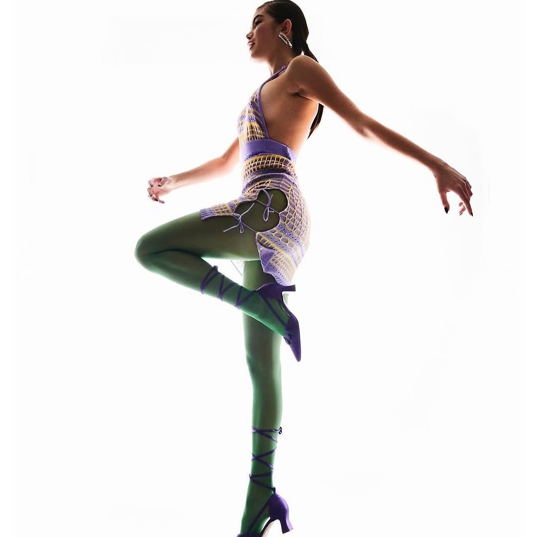

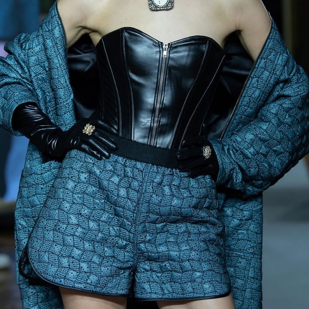
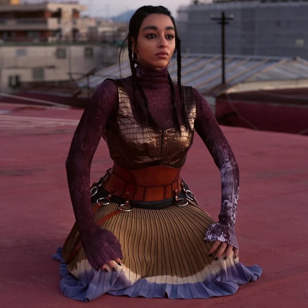
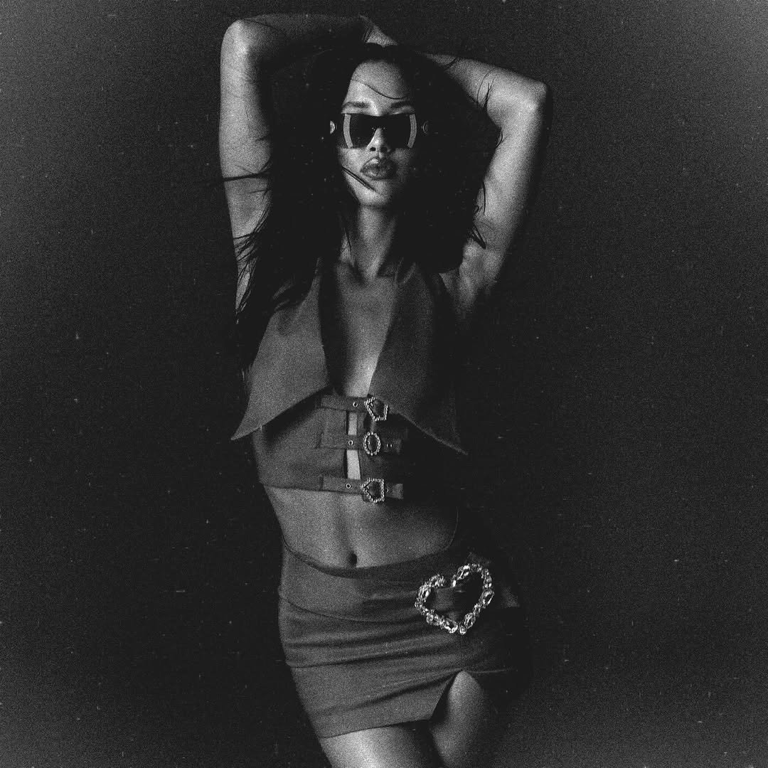
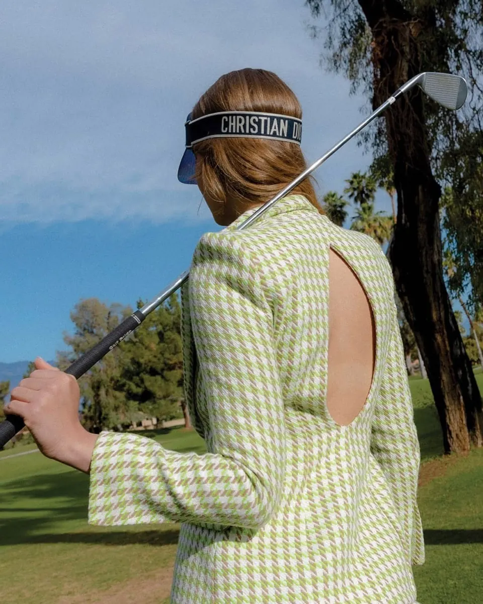
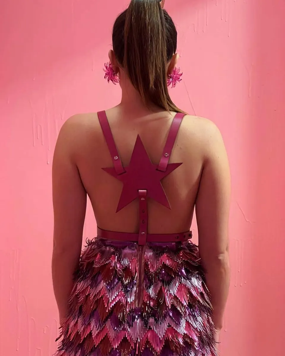
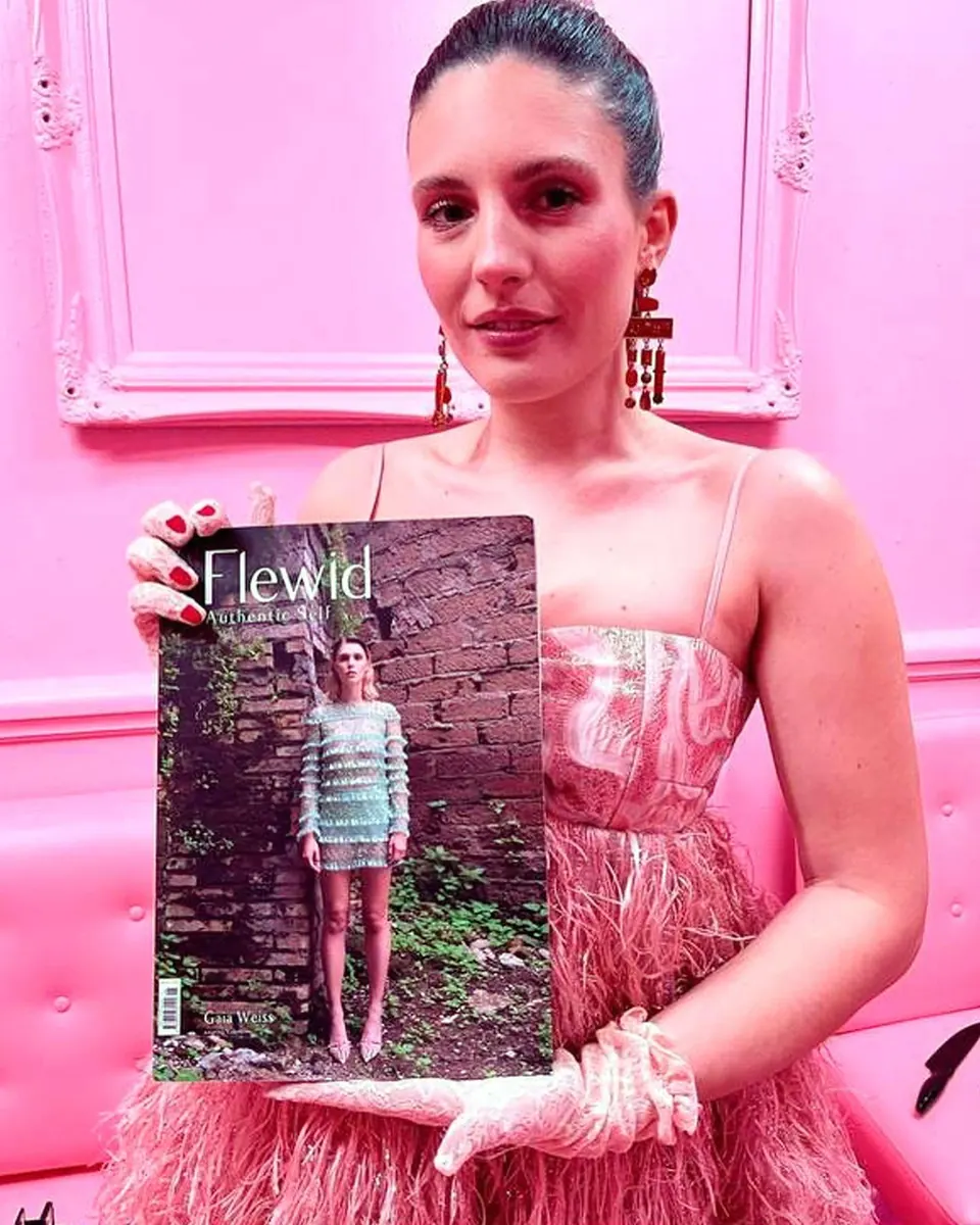
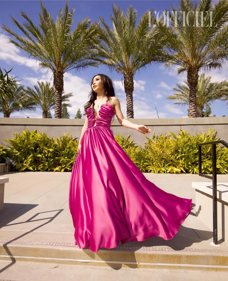
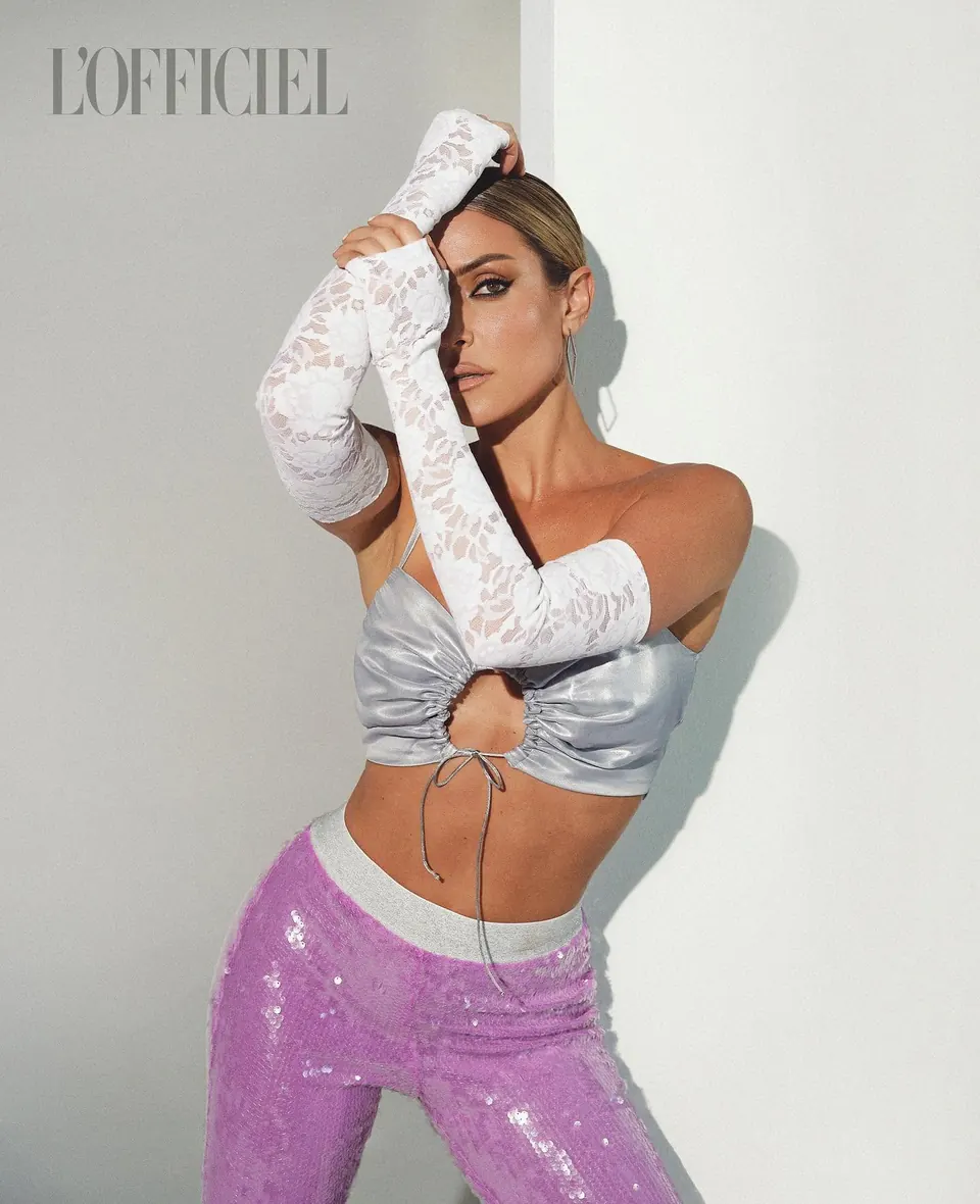
Covers of prestigious magazines such as "L'Officiel" and "Vanity Fair", alongside regular appearances in the looks of top influencers and artists in the world's most iconic settings—including the Coachella stage—backed by a targeted press office strategy in Los Angeles.
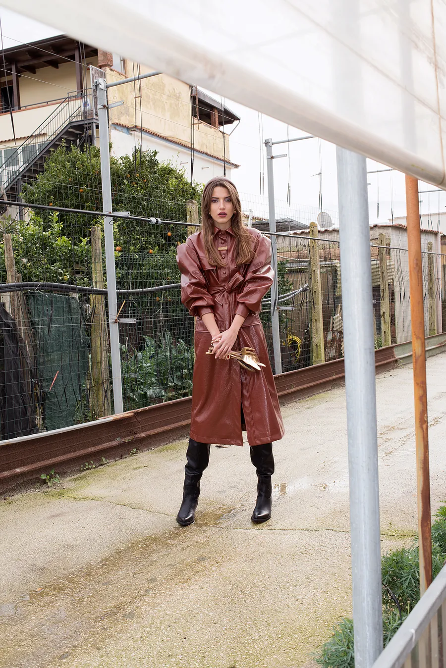
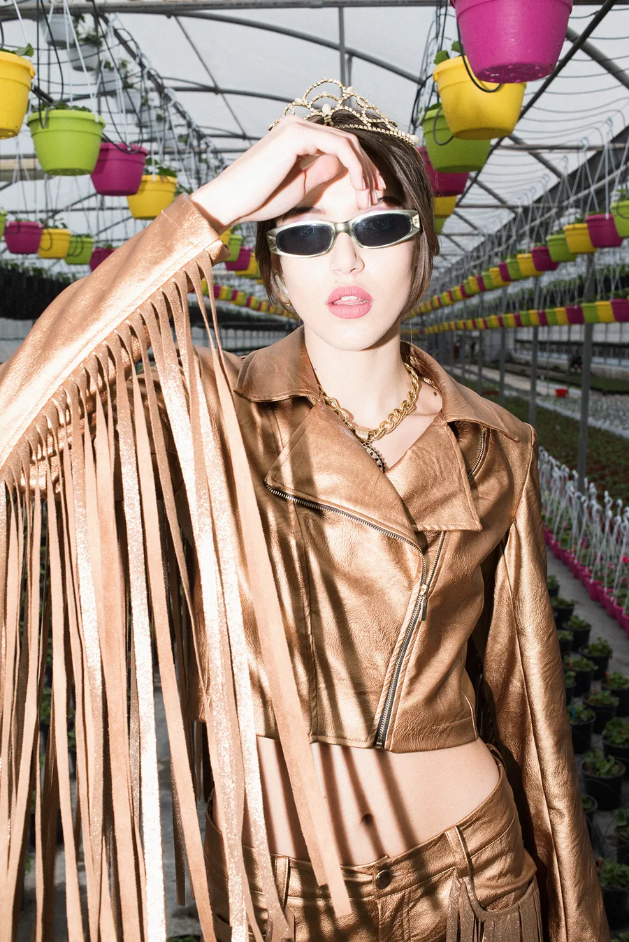
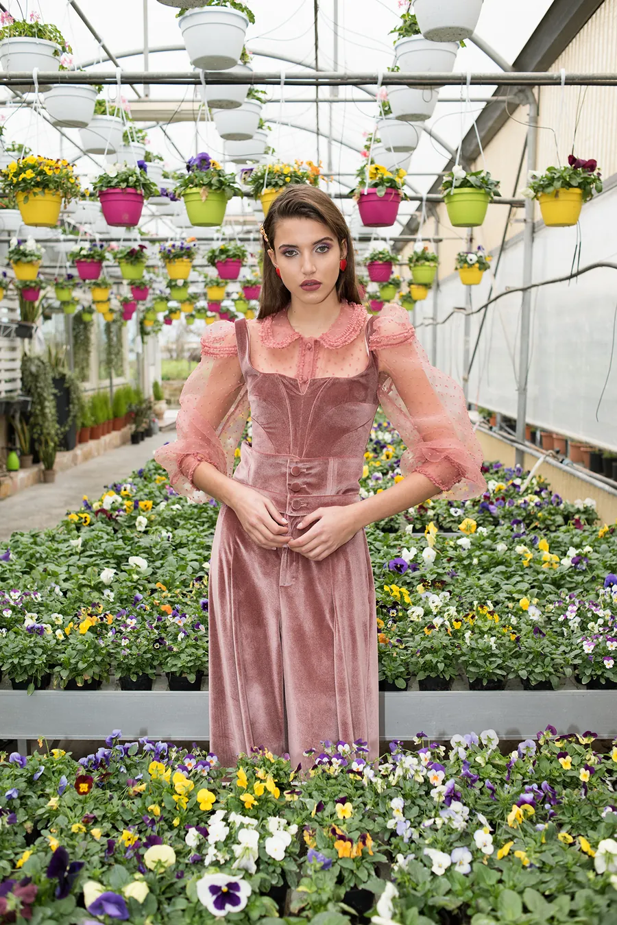
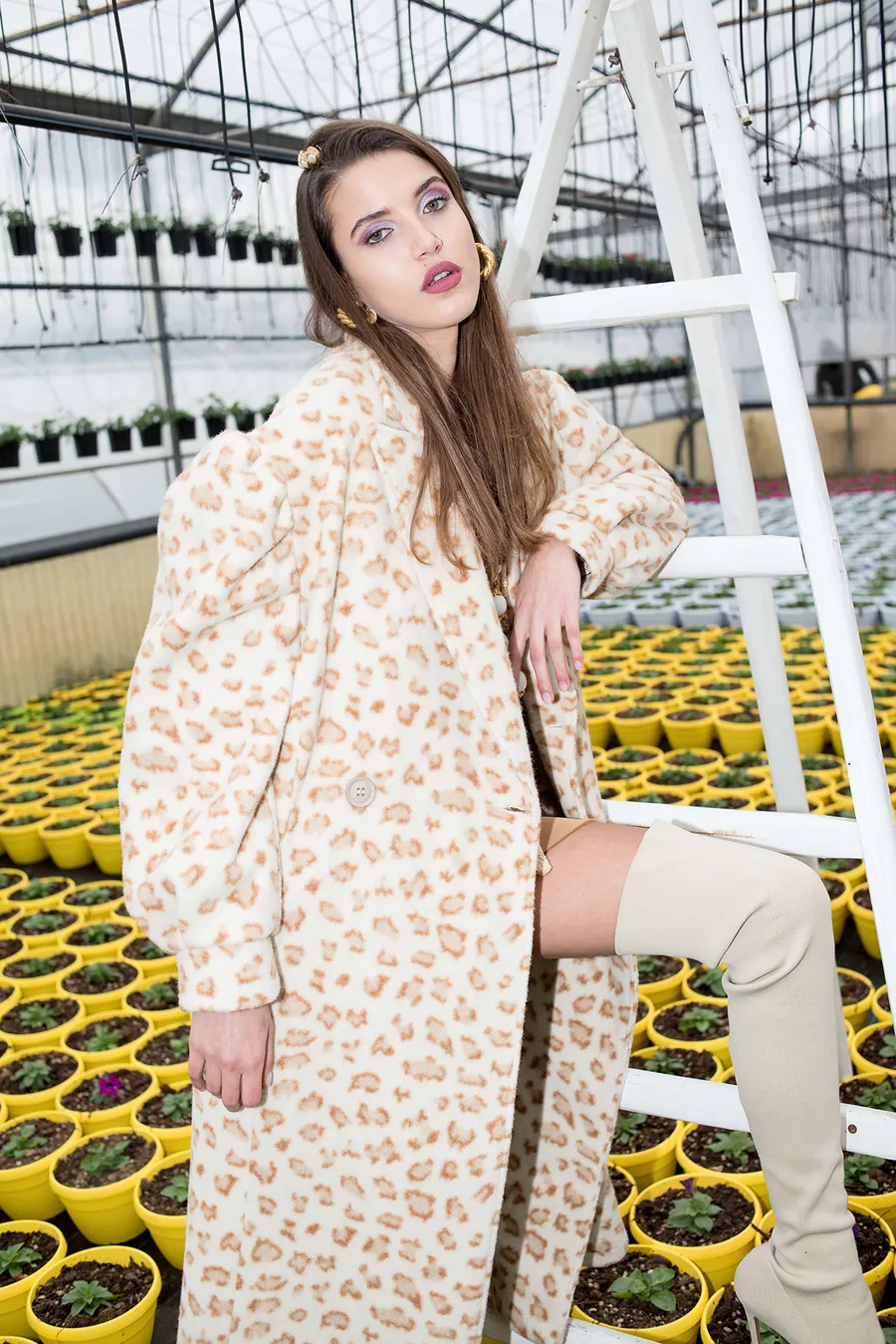
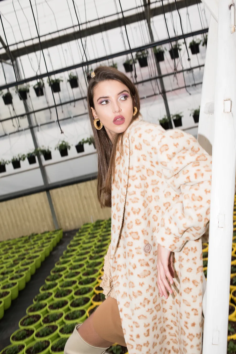
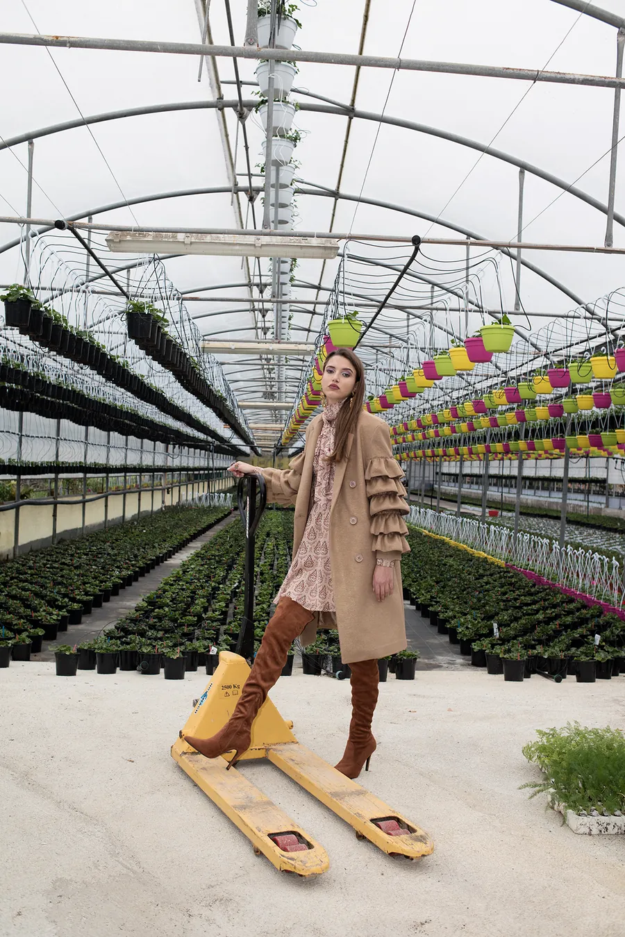
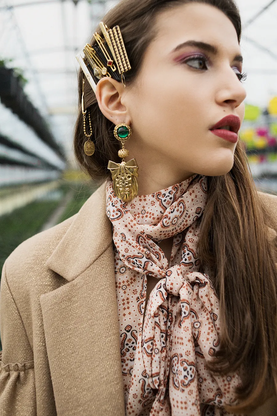
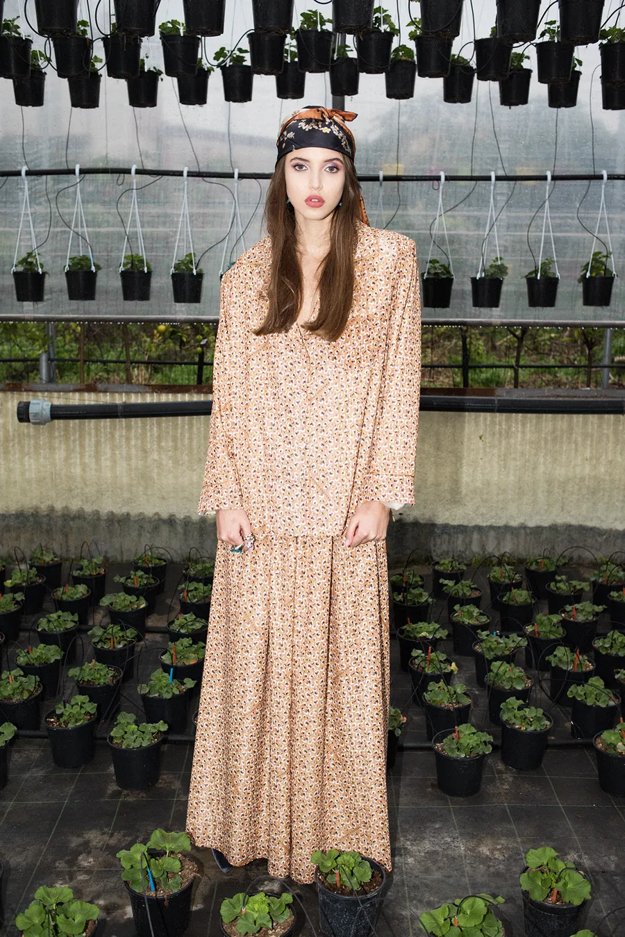
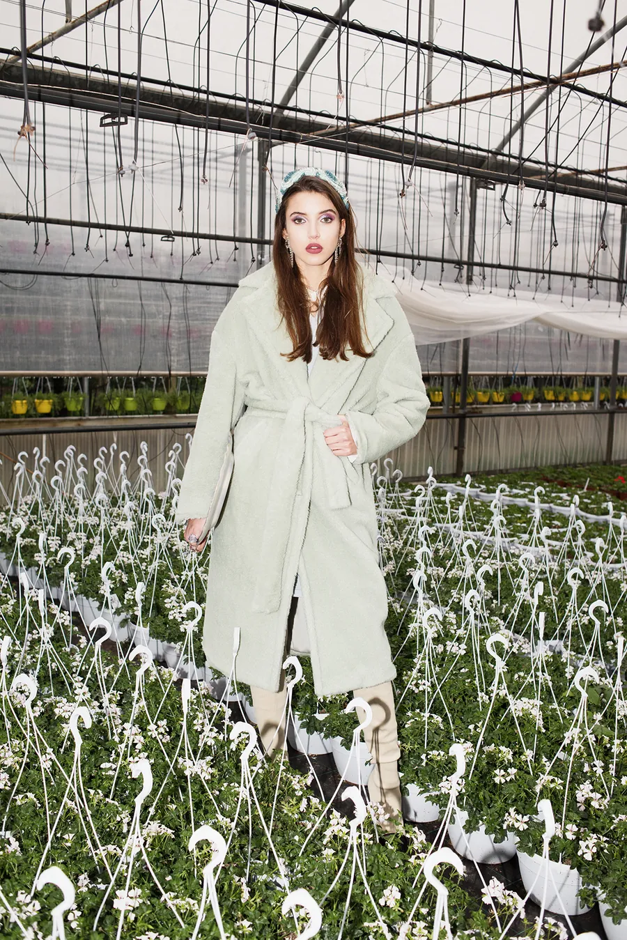
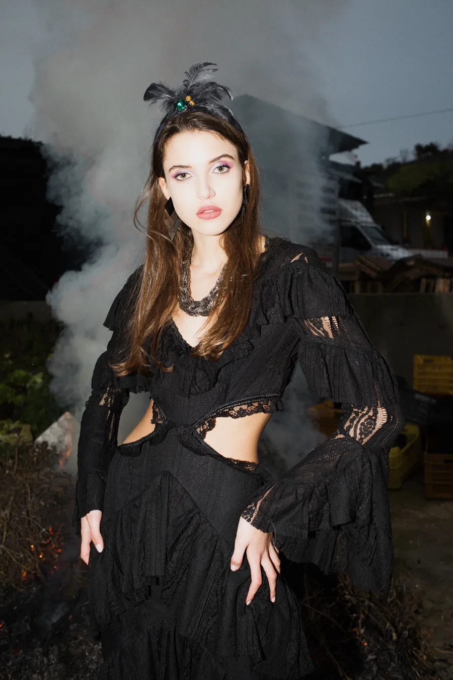
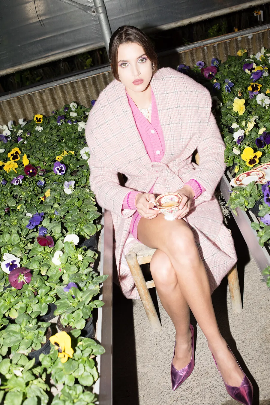
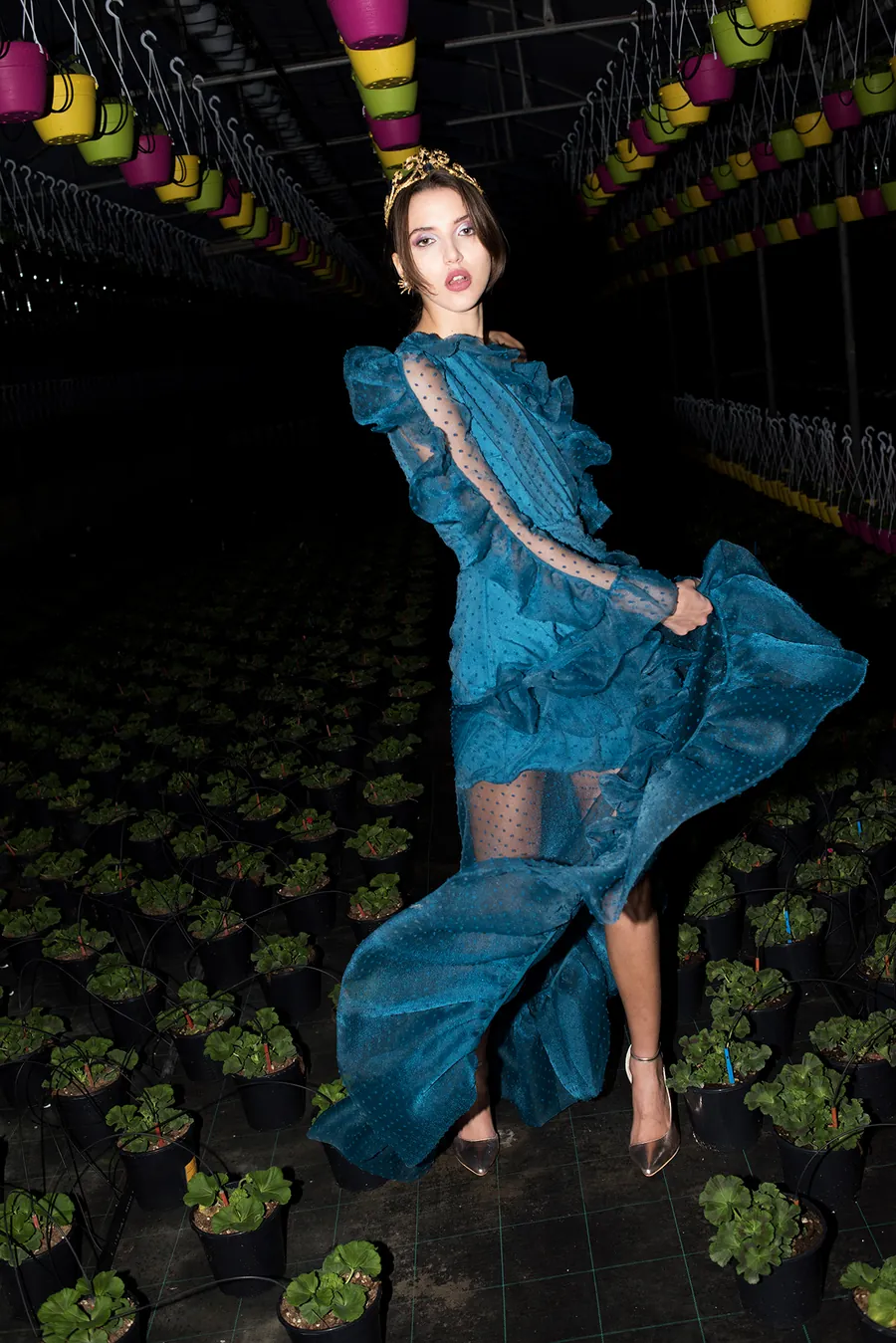
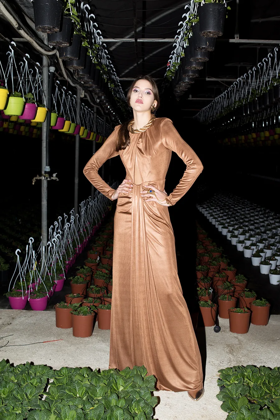
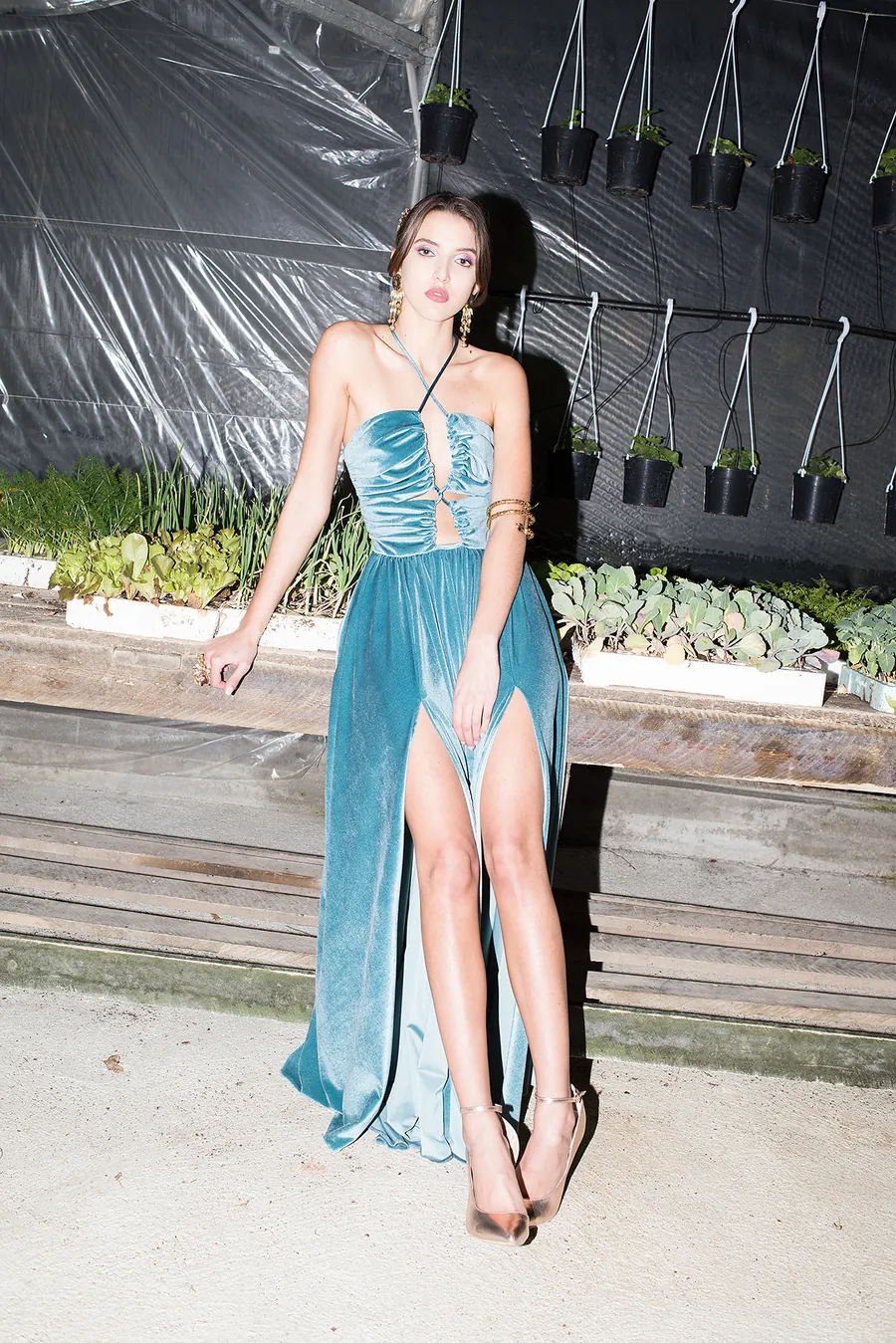
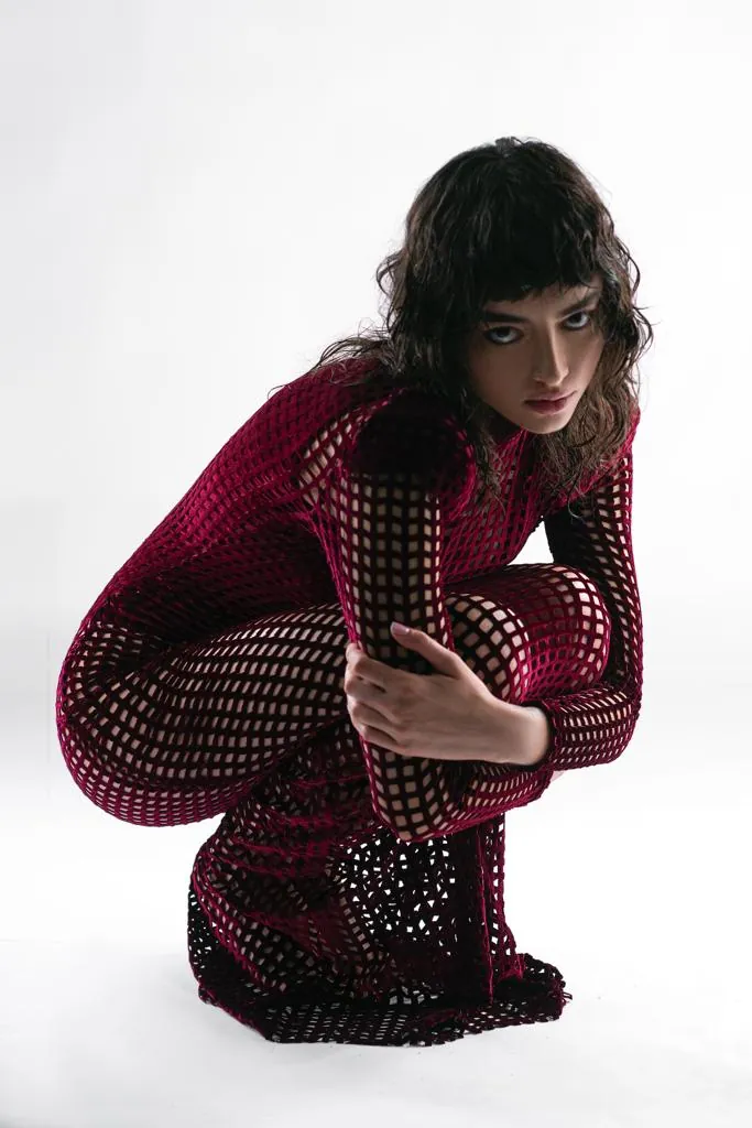
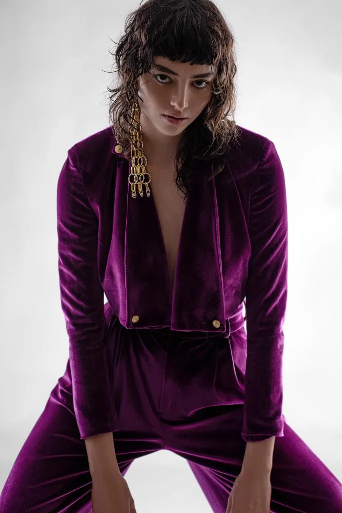
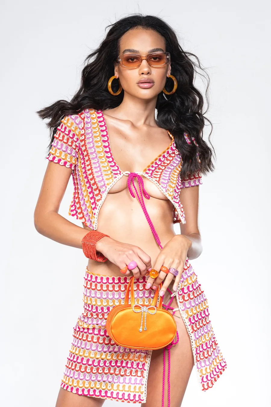
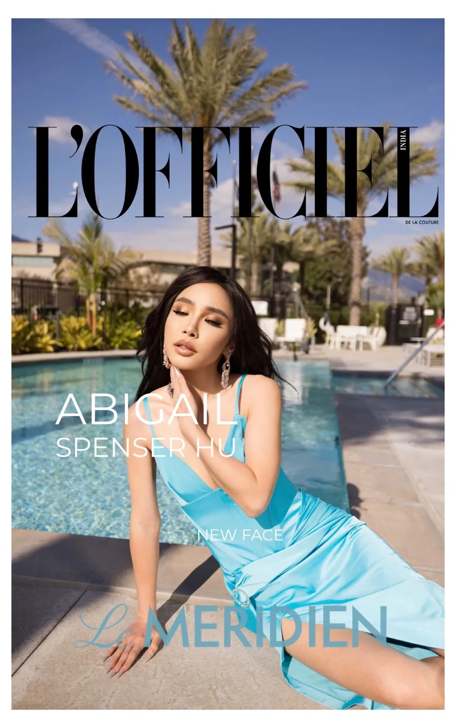
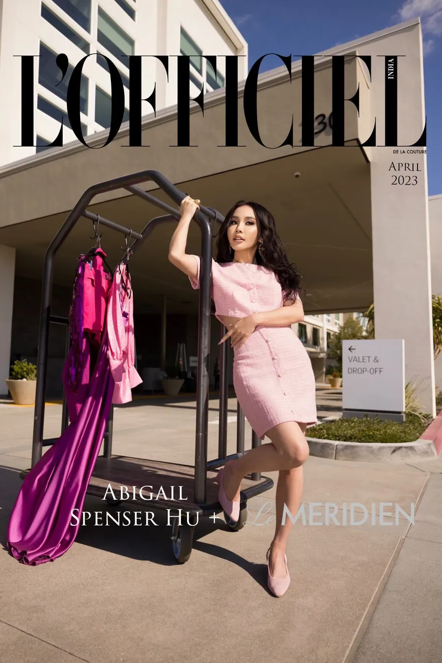
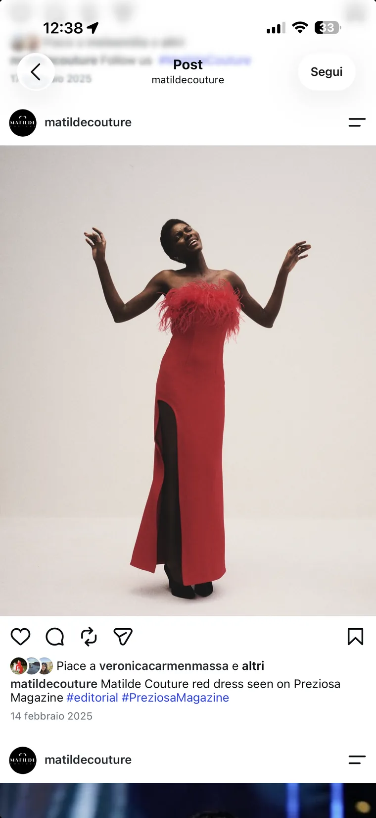
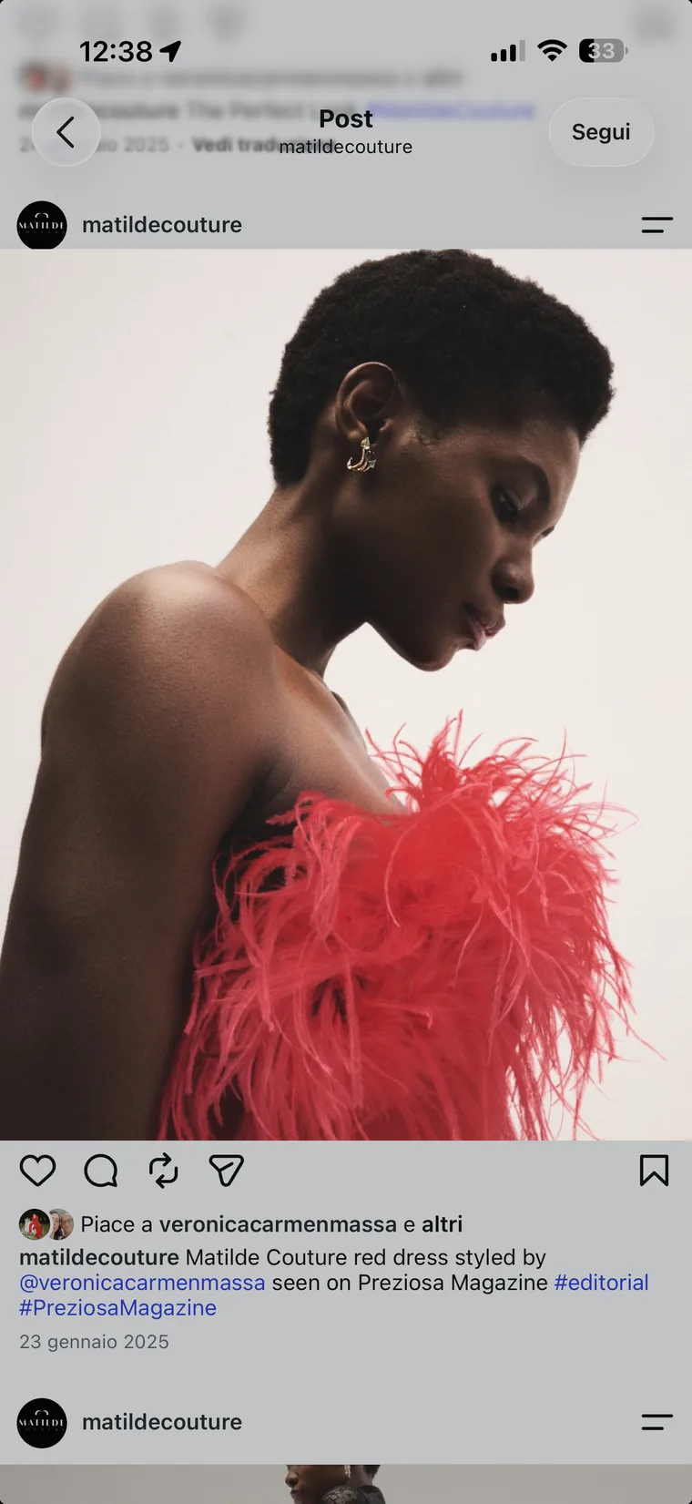
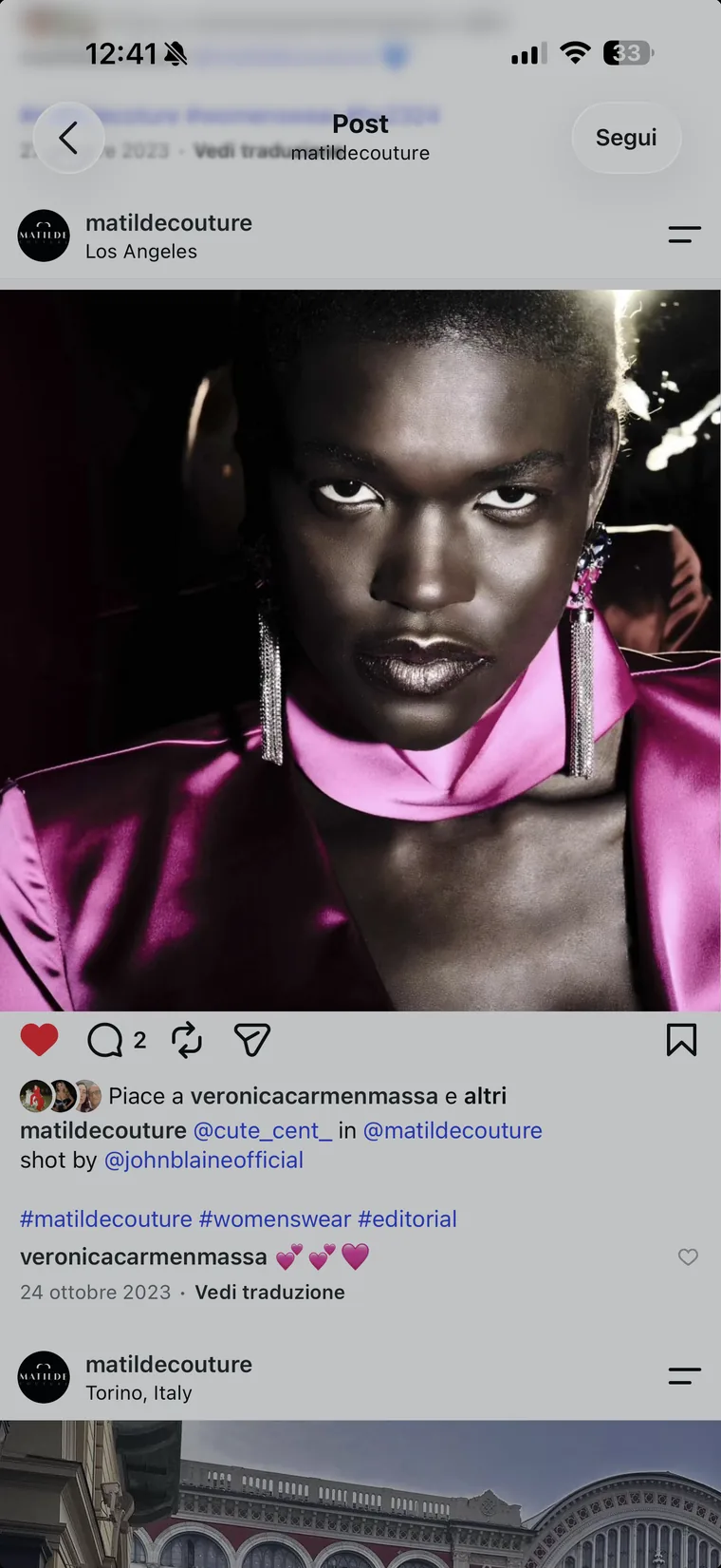
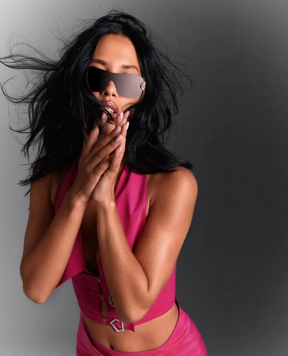
Where the collection travelled after the show: red carpets, magazine shoots and stage looks, captured as they were posted.

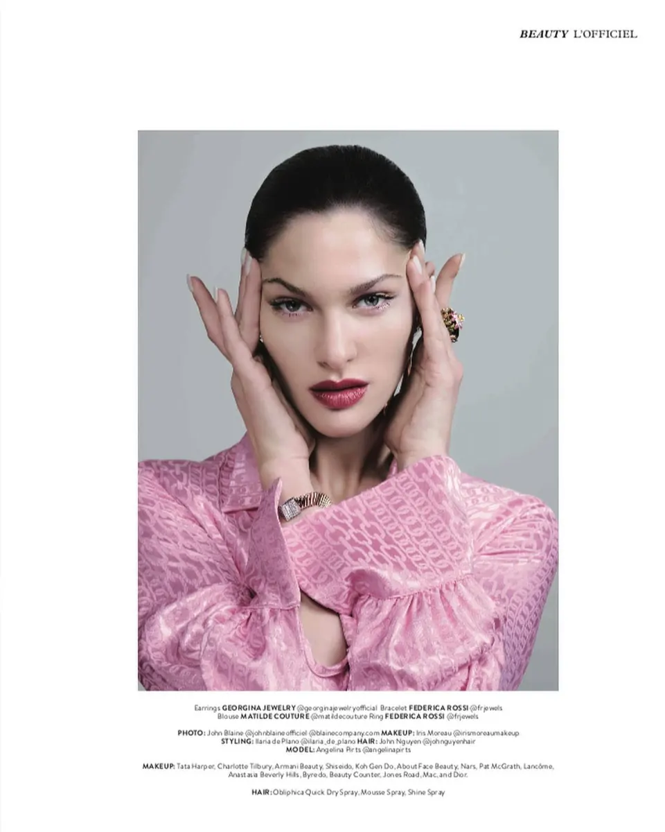
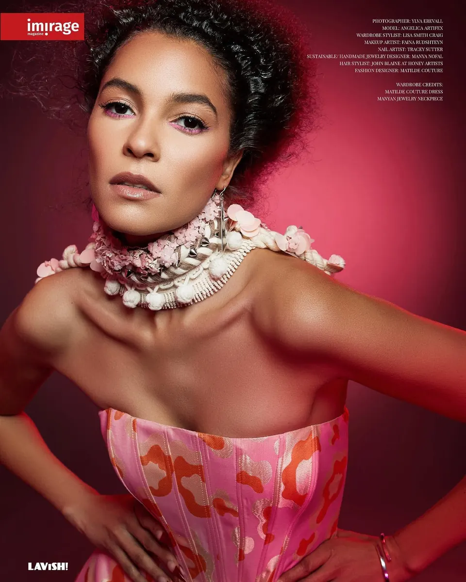
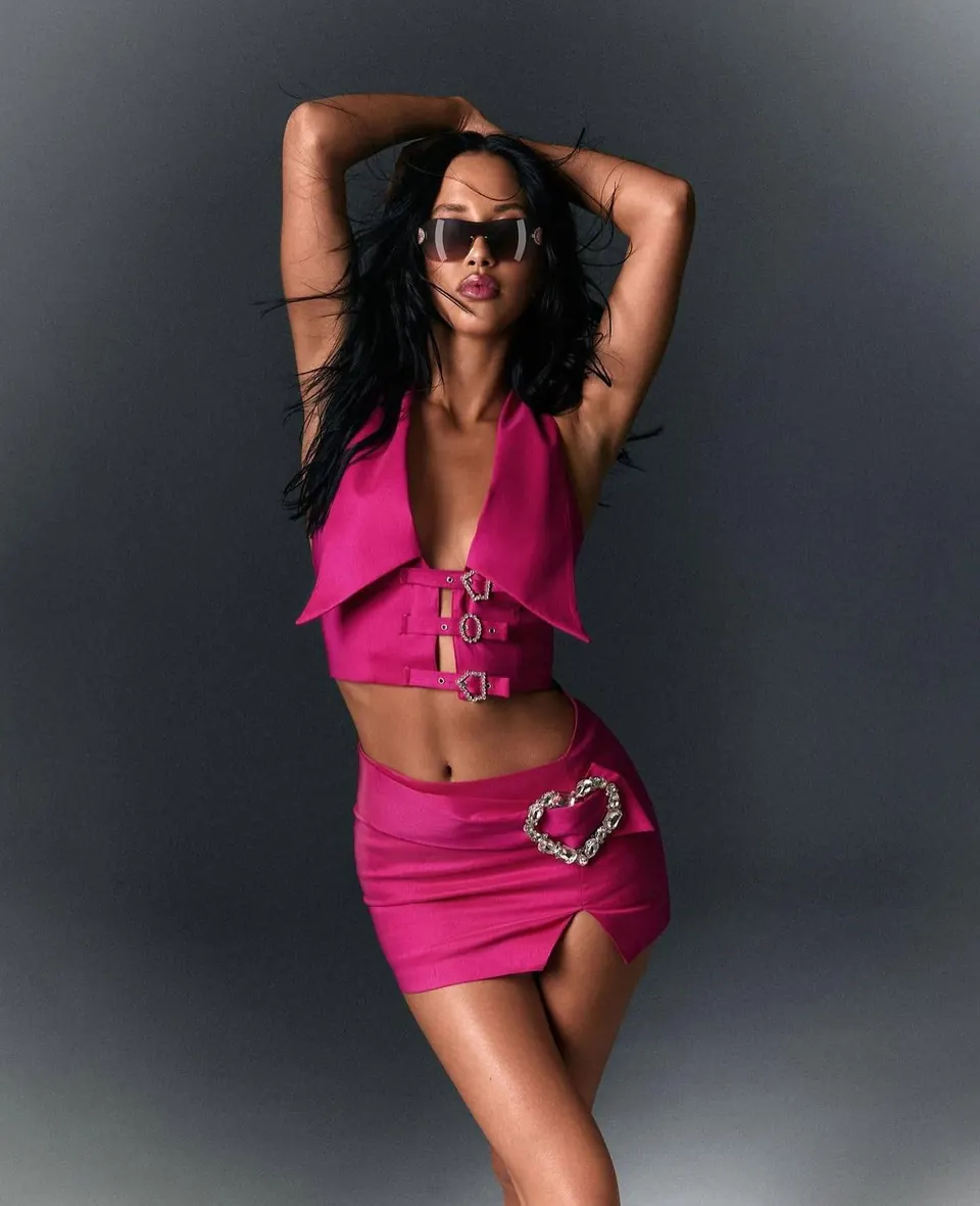
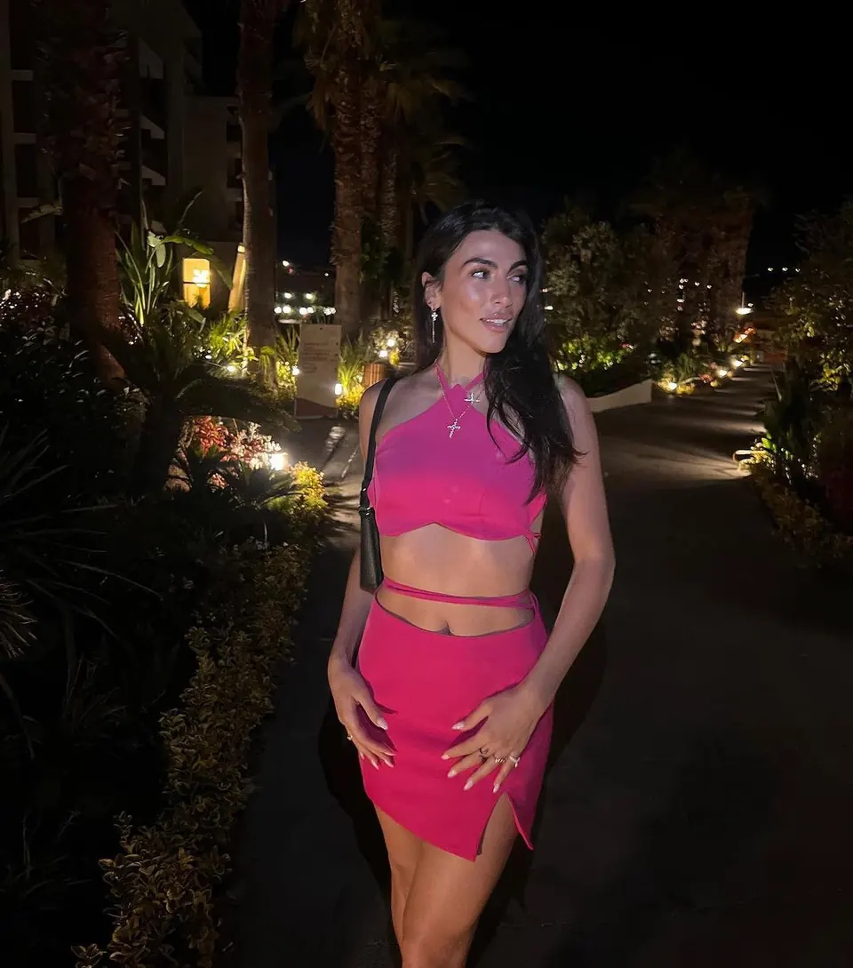
Bottega Veneta & Acne Studios
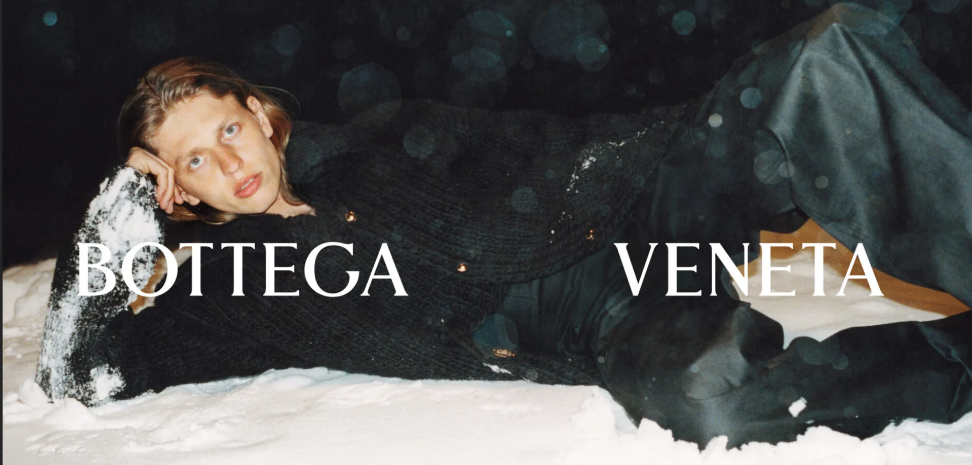
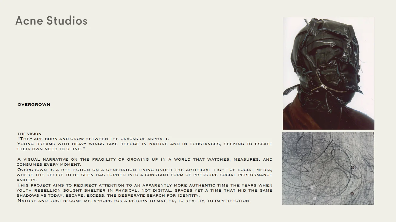
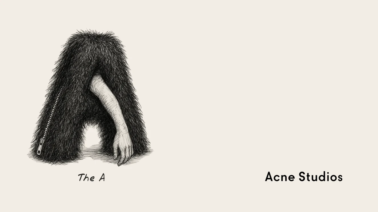
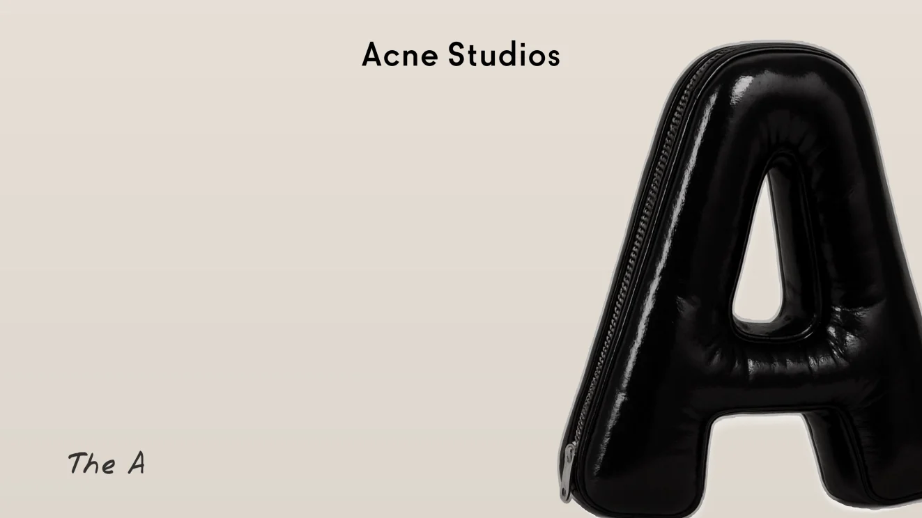
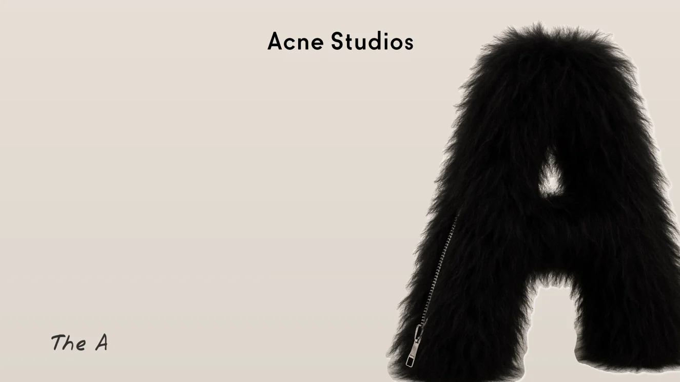
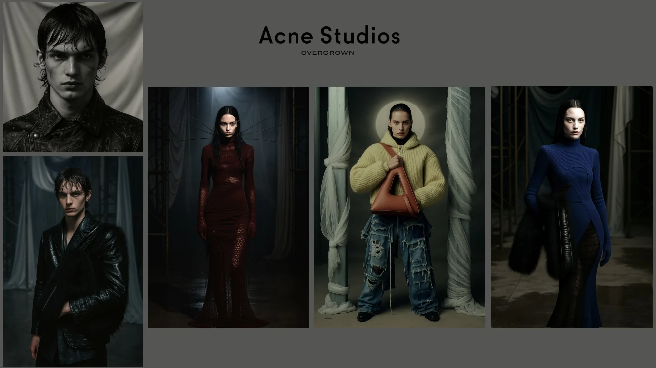
Two self-initiated campaign concepts for two houses with opposite voices: the quiet luxury of Bottega Veneta and the raw, textural world of Acne Studios.
01 — The campaign
The key visual: a single figure lying in fresh snow at night, lit by flash, with the wordmark set right across the frame. Heavy knit and liquid leather against the cold, so the texture of the pieces speaks before the logo does.
02 — The mood
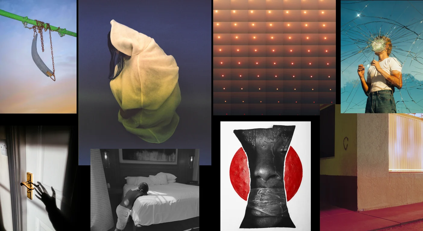
The moodboard behind it: suspended objects, faces hidden or turned away, shadows on doors and hotel sheets, a sky seen through broken glass. The palette stays saturated but quiet — dusk blues, soft pinks and a single red.
03 — The references
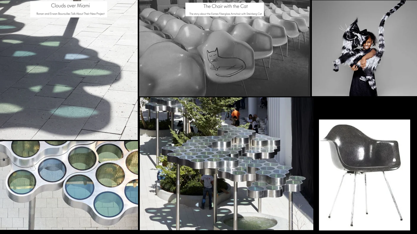
References taken from outside fashion: the Bouroullec brothers' Clouds over Miami and the Eames fiberglass armchair with Saul Steinberg's cat. Design objects chosen for the way they handle light, shadow and a single playful gesture.
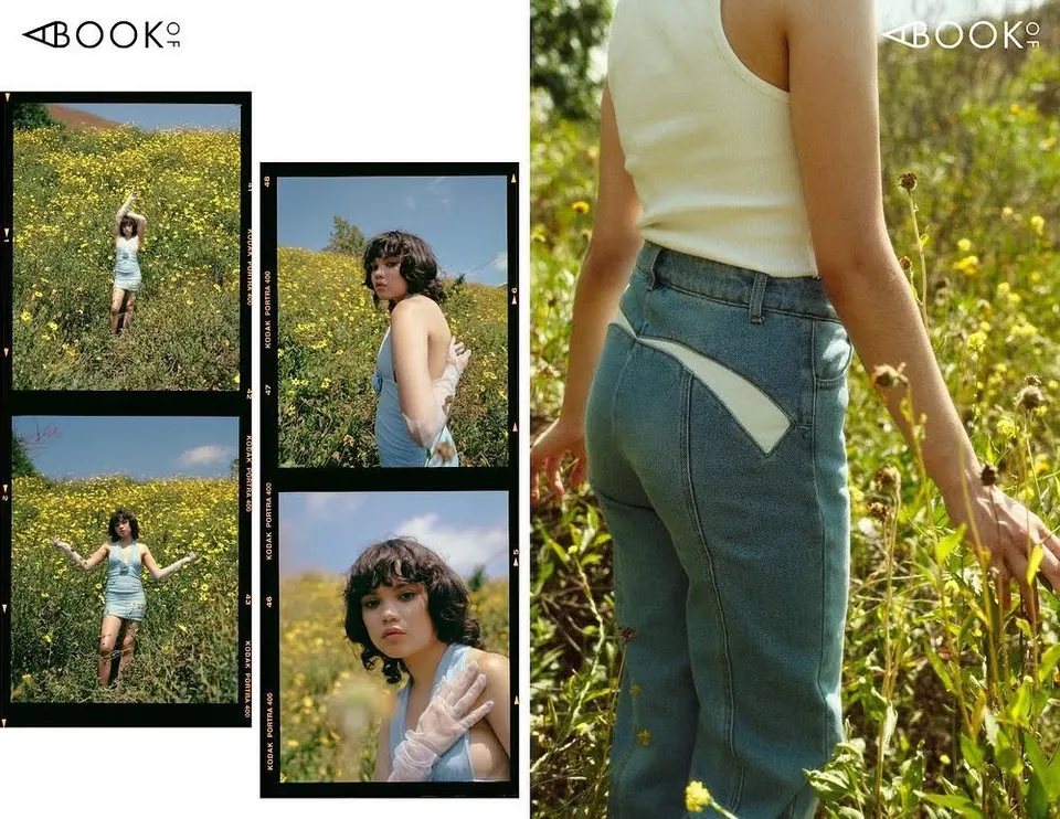
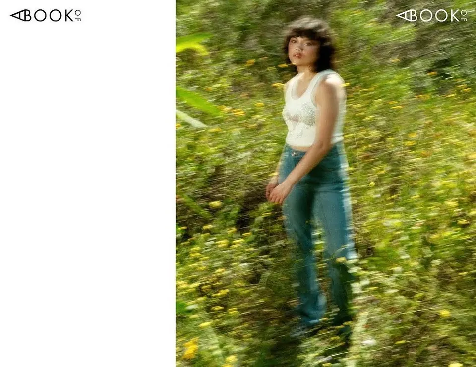
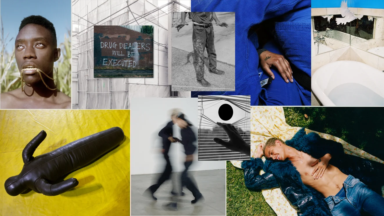
Overgrown is a visual narrative on the fragility of growing up in a world that watches, measures and consumes every moment. It looks back to the years when youth rebellion sought shelter in physical, not digital, spaces — and uses nature and dust as metaphors for a return to matter, to reality, to imperfection.
Swipe sideways
